Go High Level generates a large amount of valuable data: pipeline activity, call recordings, opportunity values, lead sources, rep performance, and more. But GHL’s native reporting, while useful, has limits. Getting to the level of business intelligence that actually changes decisions requires connecting GHL data to a dedicated BI layer.
This guide covers how to build a dashboard that shows leadership the full state of the business in under 60 seconds.

Why GHL Native Reporting Isn’t Enough
GHL’s built-in reports handle the basics well:
- Pipeline by stage
- Opportunities by status (won, lost, active)
- Call volume and duration
- Basic rep activity
What they don’t do:
- Pull in advertising platform data alongside pipeline performance
- Compare CRM lead numbers to platform-reported lead numbers
- Show external market data next to internal business performance
- Surface long-term trends with flexible date ranges
- Enable natural language reporting and analysis
For those capabilities, you need a dedicated business intelligence layer.
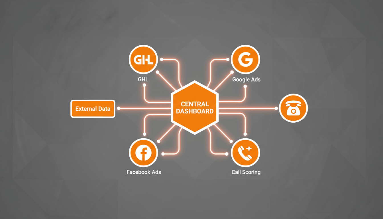
The Architecture: What Connects to What
A robust business intelligence setup for a GHL-powered business typically looks like this:
- GHL (pipeline, contacts, opportunities, calls) → BI Tool
- Google Ads (spend, clicks, conversions) → BI Tool
- Facebook Ads (spend, reach, leads) → BI Tool
- Google Analytics (sessions, user behavior, conversions) → BI Tool
- Call Scoring Data → BI Tool
- External Market Data → BI Tool
The BI platform becomes the single source of truth for leadership.
Popular BI tools include:
- Databox – Simple integrations and executive-friendly dashboards
- Google Looker Studio – Flexible and free reporting environment
- BigQuery + Looker Studio – Ideal for larger datasets and advanced analysis
Building the Core Dashboard Sections
Section 1: Pipeline Health (From GHL)
Key metrics to display:
- Total active opportunities by stage
- New leads this week versus previous periods
- Forecasted deals expected to close this month
- Average time spent in each stage
- Won deals and revenue totals
- Lost deals with loss-reason analysis
Section 2: Lead Source Performance (From GHL + Ad Platforms)
Key metrics to display:
- Leads generated by source
- Win rate by lead source
- Cost per lead by channel
- Cost per closed deal
- Platform-reported leads versus CRM-recorded leads
This section provides visibility into which channels generate actual revenue rather than just lead volume.
Section 3: Sales Team Performance (From GHL + Call Scoring)
Key metrics to display:
- Won deals by representative
- Close rate by representative
- Average call score
- Call score trends over time
- Average days to close
Section 4: Ad Performance (From Google Ads + Facebook Ads)
Key metrics to display:
- Total advertising spend versus budget
- Cost per click by campaign
- Landing page conversion rates
- CPC trends
- Campaign performance based on closed revenue
Section 5: Website Performance (From Google Analytics)
Key metrics to display:
- Sessions by traffic source
- Mobile versus desktop conversion rates
- Top landing pages
- Bounce rate trends
- Organic search lead generation
Connecting External Market Data
One of the most overlooked business intelligence layers is external market data.
External indicators often influence customer purchasing decisions long before changes appear in your CRM.
Examples include:
- Producer price indexes
- Fuel and transportation costs
- Industry demand indicators
- Seasonal buying trends
When combined with pipeline and revenue data, leadership gains valuable context for understanding market conditions and forecasting future performance.
The Natural Language Query Layer
Modern BI systems increasingly support natural language reporting.
Instead of building reports manually, leaders can ask questions such as:
- “What’s our current pipeline value?”
- “Which campaign produced the lowest cost per closed deal last month?”
- “What was our average call score this week?”
- “Which sales rep has the highest close rate over the last 90 days?”
Tools such as Databox Genie and AI-powered reporting assistants can answer these questions by pulling data directly from connected sources.
This removes the need for managers to depend on analysts for every report request.

What Changes When Leadership Has Good Data
When leadership can see the state of the business in under 60 seconds from a single dashboard, decision quality improves dramatically.
- Advertising budgets move toward channels that generate revenue.
- Sales coaching becomes data-driven.
- Pipeline bottlenecks become visible earlier.
- Forecasting becomes more accurate.
- Market shifts are identified faster.
The goal isn’t simply collecting more data. The goal is organizing the right data so decision-makers can act quickly and confidently.
Final Thoughts
Go High Level already contains most of the operational data businesses need. The real opportunity comes from combining that data with advertising, website, call scoring, and market information inside a dedicated business intelligence platform.
When everything is connected into a single dashboard, leadership gains a complete view of performance, allowing faster decisions, better resource allocation, and stronger long-term growth.